 Chris Harrison from my alma mater Carnegie Mellon University has made these beautiful diagram of the Internet Map of the World. H retrieved his information from the
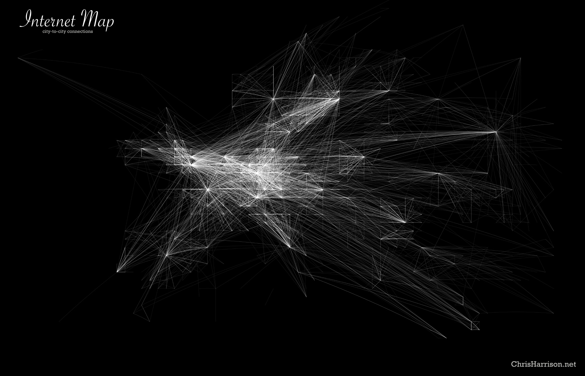
  Dimes Project which provides several data sets that describe the structure of the Internet. These magnificent drawings use their most recent data at the time of their creation in Feb 2007.
 Chris created a set of visualizations that display how cities across the globe are interconnected. This is by router configuration and not physical backbone. So even if you try to zoom into your house, we wont see you with your laptop in your underwears. There are 89,344 connections total according to the Dimes Project. I have recently emailed him to find out how he made these, what software, and where he got his info. How reminiscent is this work to the flight 404 action? mmmm It smells like open source urbanism to me!

1 comment:
flight404???
Post a Comment